
Usability Goals:
Effectiveness
Efficiency
Safety
Utility
Learnability
Memorability
Design Principles:
Visibility
Feedback
Constraints
Mapping
Consistency
Affordance
Usability Goals:
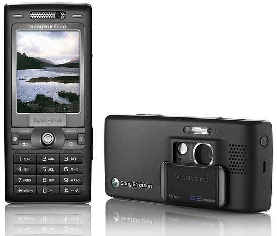
Effectiveness; the K800i has the capability to call, text, email, take photos, videos, make video calls (3G), play music, read RSS feeds, and upload photos directly to a blog. With all this and more the phone succeeds in its effectiveness in that everything works as described. The K800i has a vast range of features, some newly integrated into mobile phone technology.
Efficiency; the K800i’s menu system is alike many other in the Sony Ericsson range, with some small tweaks in the new revision. The waiting times for turning the phone on vary from 6-10 seconds, from opening the camera lens to the phone being ready to take a photo, 1-3 seconds. The phone does not feel sluggish in many scenarios however occasionally when receiving messages/emails at the same time as constructing messages/emails the speed of the text being shown on the screen will fall vastly behind the speed of the user typing the message. This is frustrating as characters cannot be viewed until a second or two after they have been input, so mistakes are most time costly and harder to correct. Also when pressing the Clear/Cancel key and the back button it is easy to accidentally depress the WAP immediate access button, or the shortcut navigating to the “Homescreen” – the area where users can “tab” or alternate between different running applications and “events”. This problem is due to the keys being incorrectly placed near to some of the most used buttons on the mobile phone, and also the way in which the buttons are designed allows accidental contact again and again. One critical problem of this button placement is that once on the “Homescreen” if a user presses the C button again, a dialogue emerges asking whether the user wishes to delete whatever is selected, be it an event such a missed call or text message, or a whole application like Bluetooth or their favourite bookmarks. The user has to press on the joystick to select yes to the prompt, which would be easily performed accidentally in someone’s pocket/bag. This is possibly more of a safety issue than an efficiency issue.
Safety; the phone occasionally freezes up(crashes), occurring more so when the battery is nearing the end of its life, or when the phone has been kept in cold temperatures. After it crashes the phone reboots and any messages or unsaved data is lost. The K800i also receives messages, plays the message alert tone and displays a new message has been received, but if the user tries to access the message whilst the message tone is still playing, sometimes the message is lost and no history of the message being received at all can be found. This is very frustrating because potentially vital information could be lost.
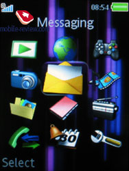
Utility; the phone’s menu system interface is easy to inter-act with, utilising tabs selectable by moving the joystick left/right and drop down menus accessible by pressing the joystick down. The phone has a wide variance of features that are easily accessible.
Learnability; the phones features and functions are easily learnable because the designers of the interface have followed already existing conventions for user design, using menu and data display systems that would seem familiar to desktop computer applications or television menu systems. Much of the learning is easy because the phone has been designed intuitively, using world-wide standards and logos for easy recognition and usability.
Memorability; the ability to map your own shortcuts and macros to a limited number of keys on the phones keypad gives the ability to reduce navigating time to experienced users. These shortcuts are localised around the central joystick and the surrounding buttons and can provide easy access to SMS writing/reading, phone call history, and to the contacts library. Even without these the menu selection system is concise and is easily memorable so much so that an advanced user can navigate through the menu system without looking. One problem with the memorability of the design is the ambuiguity surrounding the “back” button, which more realisticly should be called a “go to level above” button, which instead of taking you back to the last thing you were viewing/editing, takes you to the menu above the menu screen you are viewing currently. This difference can be hard to remember considering the presence of a “not very active” cancel/clear button.
Design Principles:
Visibility; it is clearly visible where you are navigating to and from when using the K800i. The menu system changes enough to display a change in menu, yet not enough to delay a user. The prompts and feedback are shown graphically and usually with accompanying text.
Feedback; audibly each keystroke is represented by a sound on the phone, so input is not only shown on what is displayed on the screen, which is useful when on the phone, the main time where a user will be possibly using some of the in-call functions, but not actually looking directly at the phone. Feedback is also marked by dialogues to ensure accidental deletion and editing of data cannot should not occur. This feedback is much alike the dialogues you would see in a desktop computer application, i.e. “Are you sure you want to delete this?” followed by a simple “Yes” or “No”. Text or selected items are highlighted to display to the user what information has been recorded, and animations occur to indicate waiting or progress.
Constraints; the confirmation dialogue boxes are a major part of the safeguards put in place to ensure a user cannot accidentally cause damage to data or crucial information. These act as another barrier between a user selecting an action he or she did not actually wish to carry out. The phone has alot of information shown not just via text but graphically or via animations too. This helps users to recognise the information shown and for example the text provides an accurate description of what otherwise a picture could not convey. i.e. the graphic to indicate the “Drafts” folder looks not much different from the Outbox icon, but the text conveys the difference adequately. The number pad and keyboard like the rest of the phone, follow arbitrary conventions in order as not to throw the new user.
Mapping; the relationship between the controls and their functions is visible at most times, and the mapping of the keys on the K800i is not at fault, however on the initial menu screen the right hand button accesses the main menu, whereas the left hand button accesses the recent call list, and then once in the main menu screen, the left hand button now selects the next menu option to progress to. This is not a massive mapping error, but it is confusing for new and old users to use one button as the “Select” button to access the menu, then another button whilst on the menu to “Select” again.
Also considering the fact that accidental keypad presses occur mainly on the WAP button and the Homescreen button, I would go so far as to say that these buttons should not be accessible phones central control panel because although these are good shortcuts to have, they are not used regularly enough to risk them being so close to the main buttons. The mapping looks like it has been created to abide to arbitrary conventions.
Consistency; the interfaces on the K800i are consistent throughout the majority of the menu screens, for example the tabs and drop down menu systems occur in the same way on the Contact list as they do whilst in the SMS editor. Without this consistency the phone would seem poorly designed and like a book consisting of chapters written by different authors. It is almost better to have a slightly clumsy design interface, and to be consistent, than to have a smoother design interface that varies in input method/display method/mapping. The phone expresses internal and external consistency, for example the numbered key pad appears in the same format as on other phones.
Affordances; Intuitive affordances include the joystick requiring a push or a click downwards to input data, the button with the back arrow ß indicating back, the button with the C, short for Cancel or Clear and scroll bars that read up as up is pressed. These affordances are intuitively accessible, as people all around the world will understand how a function or a feature is used. Others include on screen displays such as the pause icon showing whilst a song is playing, to indicate the functions available to the user, rather than a play button showing whilst the song is playing, which would indicate what function is being carried out rather than what is achievable by pressing a certain button. With this affordance there are multiple formats of conveying the information required, appealing to different views of constraints.


No comments:
Post a Comment